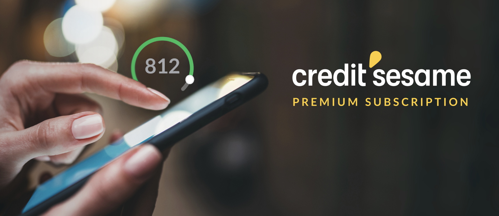
a cross-team collaboration between marketing and design to grow & Retain the premium subscription community through a series of banner experiments
OVERVIEW
My Role:
Lead Product Designer
Customer Experience Strategist
Visual Designer
I spearheaded the design and CX strategy to enhance in platform banner designs and copy in a cross functional collaboration with the marketing organization. Our efforts allowed the company to uncover new customer insights and rethink how we were communicating with new and current Credit Sesame customers.
In addition to leveraging industry standard tools like Figma & UserTesting.com, I utilized Mixpanel and Optimizely to analyze our engagement data to identify drop-off points in the customer journey. Blending my design and analytical thinking approaches was key in revamping our strategic approach to grow and retain our premium subscriber customer base.
Platforms:
Mobile (iOs, Android)
Web
The Team:
Senior Marketing Designer
Senior Copywriter
Product Manager
2 Developers from Premium Pod
Head of Premium Subscriptions
The Length:
April - May 2022
FINAL BANNERS & UPSELLS

Click to make bigger
The final “chosen” banners/upsells that converted over 30,000 basic users into Premium users in 3 months and brought in 20,000 new users totaling a 50k conversion.
Ultimately, this also hit multiple business & customer satisfaction objectives:
We were able to successfully integrate the Rent Reporting feature into our Premium bundle, highlighting it as a new “must have” feature that our customers would benefit from.
Customers were better educated on the importance of having a healthy credit score, which increased their chances at meeting their financial goals and decreased their chances of staying in debt.
The developers were able to fix loading issues on the iOs platform, resulting in a faster, more seamless user experience, and opening future opportunities for stronger user engagement/conversion.
Best of all, we helped bring down customer support inquires by 20%. It’s a win all around! 🏆
Current situation
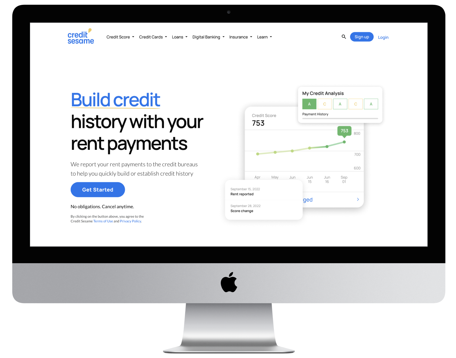
The Premium Subscription team has over one million users who use our products to get out of debt or buy a home or car. Credit Sesame acquired a rent payment reporting start-up in early 2021, aiming to integrate it into Credit Sesame Premium.
Rent Reporting home page (click to check it out!): And yes, we found that most of our visitors and sign-ups happen over desktop/web! Surprising, but also not, given that most of our tech updates happen on the web before mobile. Users were the most comfortable in trusting our Web platform more than our Mobile platform. Is that a problem? Perhaps, but not a huge dealbreaker for the business.
Before I joined, the team had run upsell banners throughout our mobile app and desktop web platforms with little strategy, leading to a loss of business potential due to low user conversions and engagement.
After discussing with our Head of Premium and Product Manager, we all had the mindset of:
“Let’s change that, I think we can do better than this!” 🚀 👏
THE MISSION
We at Premium would like to run banner and upsell experiments with copy, image and CTA variations to see if we can get our vulnerable customers (those in 0-650) score range to convert into Premium users.
As a business we will see more conversion and for our customers they will get the elevated support that comes with our premium product line. We’re in it together.
How we started
After several conversations and brainstorming sessions on how we’d like to approach this, I was tasked to lead and work closely with our Product Manager to get trained on optimization platforms like Optimzeley and Mixpanel, an analytics tool used for SaaS products to get insights into user engagement metrics and event tracking. Using these tools along as a design audit, I was able to identify the following issues (see image below) :

Stats pulled from MixPanel to help scope out the current situation and guide our starting point.
Going down memory lane
From previously conducted user tests, research, and marketing projects we found that:
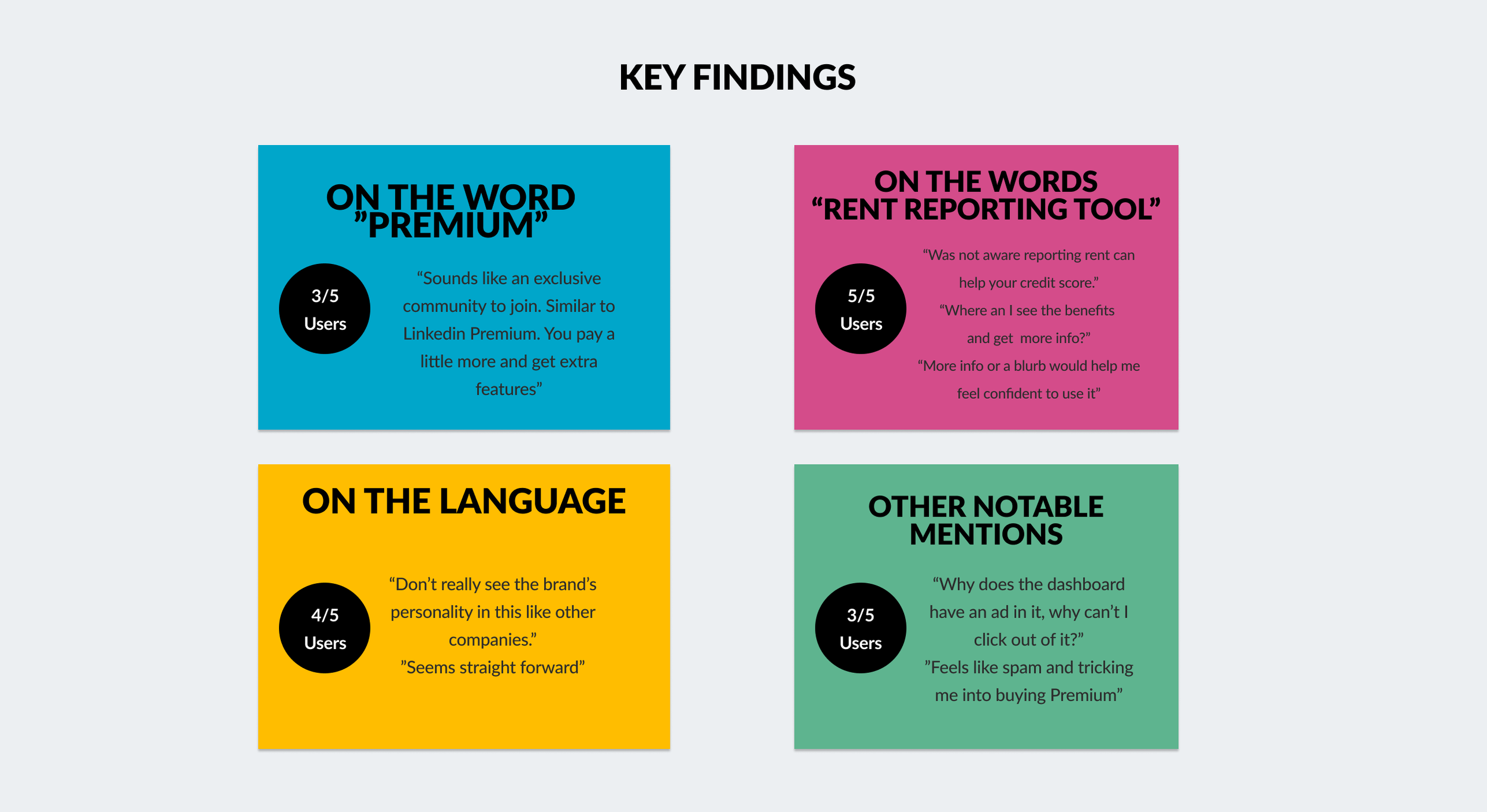
Users gravitated more to real-life stock images vs. illustrations.
“A sense of connection and “realness” that gave them trust and a feeling of community. One user even went as far as saying “ I can see myself in them”.
The copy that did convert well-had facts vs. acting as an ad. Ultimately, we found this educated users on why they should convert, how Premium boosts their credit score, and when to expect to see results.
The placement of the CTA at the top prompted higher conversion rates and engagement on mobile as it was easily accessible and probed users’ curiosity on what the offering was. “I’m not sure what this is but I think I’ll take a peek and browse!”
Users preferred the banners vs. the upsell that lived in the home page dashboard on the web because it didn’t feel forced, confusing, or overly “spammy”.
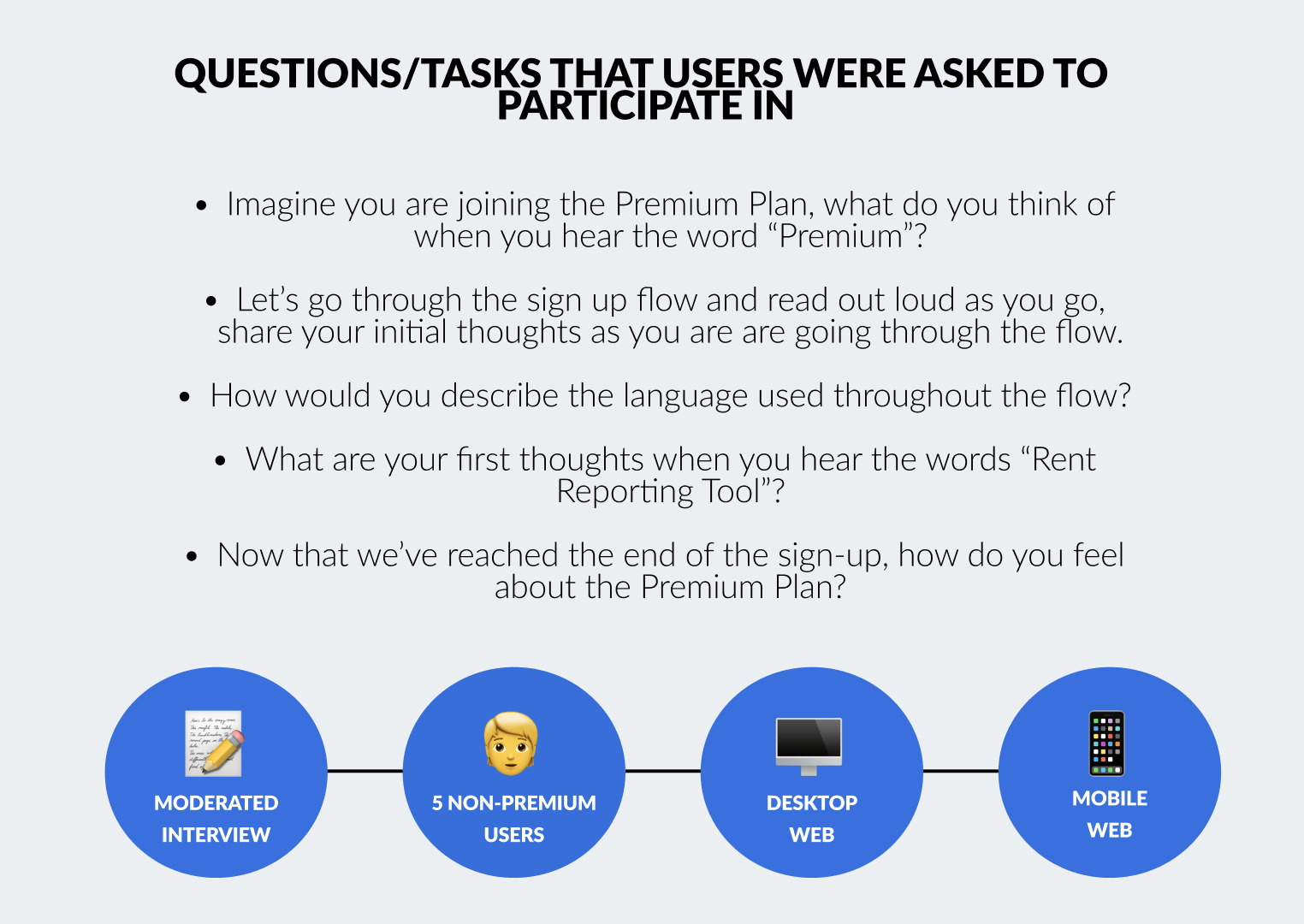
ZOOMING OUT, IN ORDER TO ZOOM In
In order to get a better sense of where the customer pain points lied, and how users land on specific upsells
I did an audit with both our mobile and web platforms
Tested the flow with 5 non-premium users all who fell within the credit score range from 0-650.
I had participant of them go through the flow on both web and mobile and asked open ended questions around : the copy, CTAs, information architecture, and overall understanding of the sign-up journey.
I brought my findings and main insights to the team and we discussed what was possible and what wasn’t (Tech stack issues, legalities we had to follow, how big of a scope some issues were, and if we had enough time to tackle everything within just a few sprints)
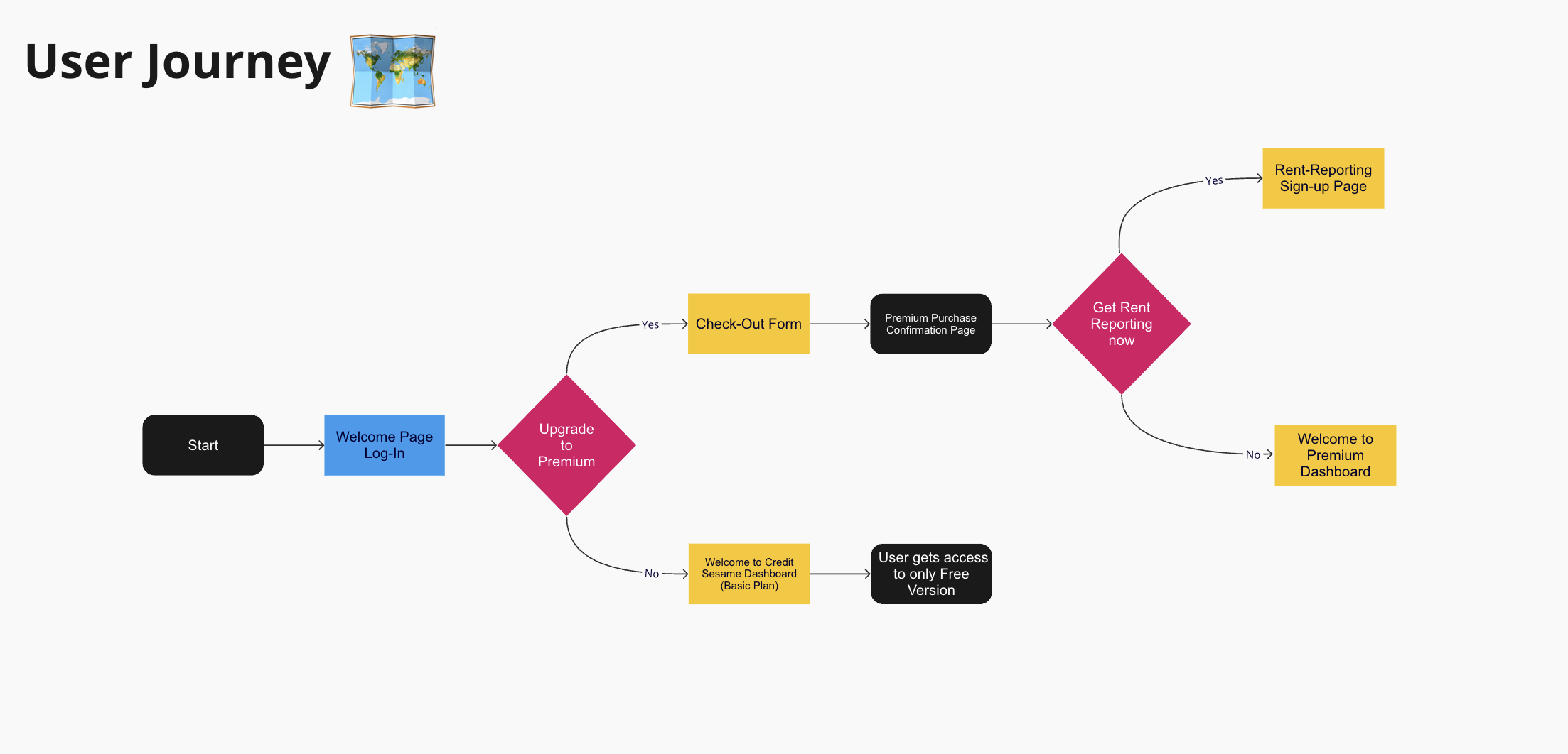
A journey map depicting the touch points a Credit Sesame user walks through in order to become a Premium user vs. not.


TWO TEAMS ARE BETTER THAN ONE
At this point in the process, we felt it was time to chat with our friends in Marketing to see what ideas we can pull together to test. We knew we were going to run multiple variations and needed their expertise in graphic design and word smithing to help reach highest impact. After all, nothing great is ever built alone. 🤝
After several working sessions and back and forth we came up with a couple variations to test against one another as well as our existing upsells and banners using Optimizeley .
In conversation we decided to approach with the following:
Target Audience Segmentation
The why: Based off what our internal data is telling us and what our product line aims to help our customers achieve.
Is there an opportunity to strategicially story tell and give our users a visual image of “what could be” if they joined Premium?
Imagery that connects with users who are looking to buy a car
Imagery that connects with users who are looking to buy a home
Imagery that connects with users who are looking to get out of debt/get educated on having a healthy score
Various CTA options
The why: We want variation to guide us in the right direction and to either support or contradict our initial assumptions.
Are users dropping off/not converting when they see “Start Free Trial” vs. “Get Premium?
Various Copy options
The why: We want to figure out how receptive people are to the language. What makes them want to join the Premium community? What makes them not? Are there triggers?
Is there opportunity for us as a business to up our game when it comes to voice, tone, and personality?
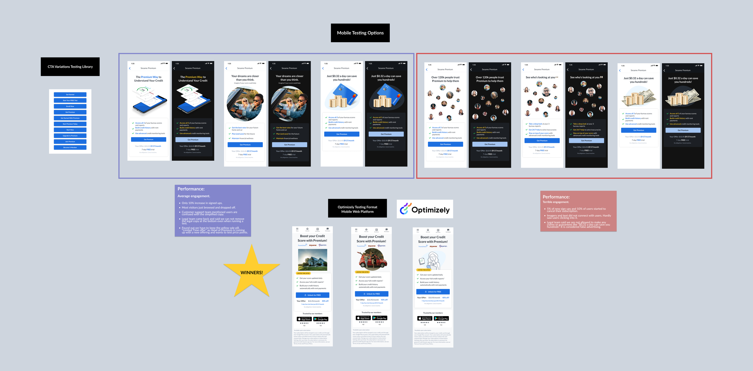
Mobile designs that we tested. (Click to zoom in)
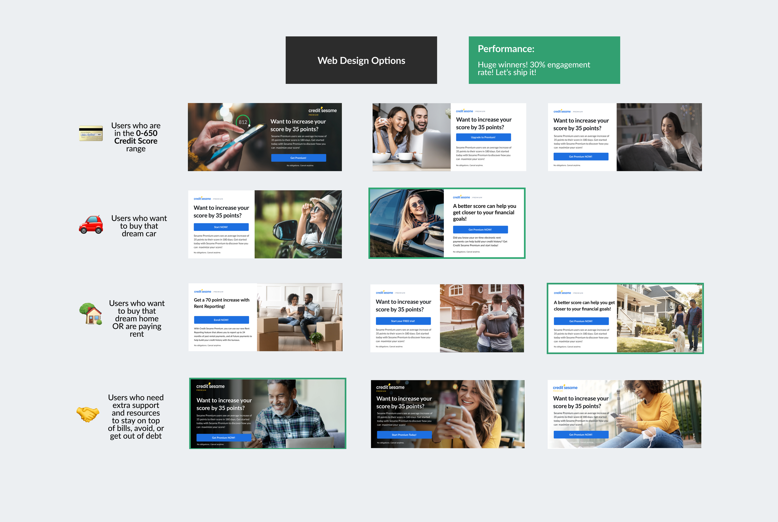
Web designs that we tested. (Click to zoom in)
TESTING, TESTING, 1, 2, 3
After going through several iterations to make sure we were aligned with our objectives, we solidified on a few batches of Banners and Upsells to test against one another as well as against our current winners and losers to buckle down on the pain points and validation around direction for success.
We set up the tests in optimizely and had them running for a few days on both web and mobile platforms to track engagement. I went in and checked them at the end of each day and compiled a report showing the metrics and met with the Marketing team to discuss next steps in the development phase. We then worked with our developers to implement it into our iOs, web and Android Platforms.
LIMITATIONS & CONSTRAINTS
Like all things with technology, sometimes things don’t always go as planned and we have to strategically pivot and think on our feet.
After our first day of testing, we noticed that our Android platforms were having issues with load time and kept crashing, which led our data to be fragmented and not accurate. I met with our developers to see if we can fix it within the sprint or if there was a quick work-around for us to salvage the data and keep us moving.
With a couple different troubleshooting techniques conducted we found that it would take much longer than just one sprint to fix the issues. Android phones are all slightly different based on the type of model the user has (Samsung, Pixel, Motorola) specifically, there are currently many different versions of OS running on these phones. This makes it trickier and takes longer to design and develop for an Android phone. Where as iOS/Apple phones have very few differences, it’s more one size fits all.
WE PIVOTED & COMPROMISED
At this point we were very pressed with time as we wanted to have something in the works to show the head of our premium team by the end of the week and start planning for the next sprint. We compromised and said for this sprint we’ll only design and test for iOS and web since those two platforms have our largest active user base and conversion rates. As a business we will benefit from getting a large data set of results to work with from our most used platforms to start with.
Next sprint we’ll focus on android allowing the developers to have more time to work on it, and catch any issues that may come up async. From the design end, this gives us some time to design with details in mind (different android screen sizes etc.) and also digest the learnings from the other platforms giving space for potential new ideas. We are an agile company after all! We iterate and keep it moving!
OUTCOME & IMPACT
After running the tests for web and iOs platforms these were the final “chosen” banners/upsells. They successfully converted over 30,000 non- Premium users into Premium users in 3 months and brought in 20,000 new users totaling a 50k conversion.
We have fully implemented them into our platforms and they have been running live ever since.
Now, we have to make sure all goes well with our Android designs and development, but that’s the challenge for the next sprint!
Ultimately, this also hit multiple business & customer satisfaction objectives:
We were able to successfully integrate the Rent Reporting feature into our Premium bundle, highlighting it as a new “must have” feature that our customers would benefit from.
Customers were better educated on the importance of having a healthy credit score, which increased their chances at meeting their financial goals and decreased their chances of staying in debt.
The developers were able to fix loading issues on the iOs platform, resulting in a faster, more seamless user experience, and opening future opportunities for stronger user engagement/conversion.
Best of all, we helped reduce customer support inquires by 20%. It’s a win all around! 🏆
Both our Premium and Customer support teams were very impressed and happy with the results, specifically, how we were able significantly reduce friction for the Customer Support team, something the company had been wanting to tackle for quite some time.

Winners from the Tests
REFLECTIONS
This was my first time getting to learn how to utilize Optimizely and Mixpanel to strategically guide our designs and testing direction. I really enjoyed being able to use quantitative data to back up our mission and am excited to use tools like these again in the future. As always, getting to join forces with other teams and learn from one another is always fun and very valuable.
Something I wish I had done differently was taken the time to understand the technical differences between running a test on an iOS device vs Android, I should’ve looped our Android developers when we were in the early stages of designing our test plan and had them share their thoughts and help guide us. I think this would’ve helped catch that road black much earlier, come up with a work-around with the time we had, and maybe we could’ve still fleshed out some Android tests in that same sprint.
You live and you learn!
LOOKING INTO THE FUTURE
As we know, design never ends, it's a continuous, iterative and learning cycle. For the future, I hope things go smoothly on the Android side, and we continue to get valuable data to help propel the business further and a good experience for our growing Premium community.
It would also be interesting to see if there’s opportunities to further help Customer Support with the magic of user education and interactive design. Something we had discussed was having a support bot pop up or a drawer pop up that lists the most common questions people have had about our premium plans.
I’m excited to see how this all evolves in due time.